518foodies is a community group in Upstate NY that connects food enthusiasts to share reviews, recommendations, and recipes, while also offering exclusive discounts through partnerships with local restaurants.
I was responsible for redesigning the entire application to improve the user experience. The main goal was to create an engaging user interface and ensure a great overall experience for users.
Year
2024
Role
User Researcher, UI Designer
Tools
Figma, FigJam, Notion
PROBLEM STATEMENT
The 518 Foodies app has outdated design that fails to provide an intuitive and modern user experience. Clients are unable to easily search for nearby restaurants, which impacts their ability to find dining options in their area.
The lack of a map view makes it difficult for users to visually locate and explore restaurants close to them. To enhance user satisfaction and engagement, a refreshed design with an interactive map feature is needed, allowing users to easily search for and discover nearby dining spots.
DESIGN PROCESS
Design Audit
In a bid to improve the user experience of the app, without any data on users after the first launch of the app, I conducted a design audit. I leveraged on the Abby Covert information architecture heuristics.
KEY INSIGHTS
01.
All screens had a consistent color scheme, font size.
02.
The text field on the Buy card screen was inconsistent with the other text fields. While most screens had outlined text fields, the Buy card screen had an underlined text field. Additionally, the buttons on the profile and payment screens were square, whereas the buttons on the other screens were rounded.
03.
Navigations on the design was intuitive
04.
The overall design looked outdated compared to other competitors in the restaurant busine
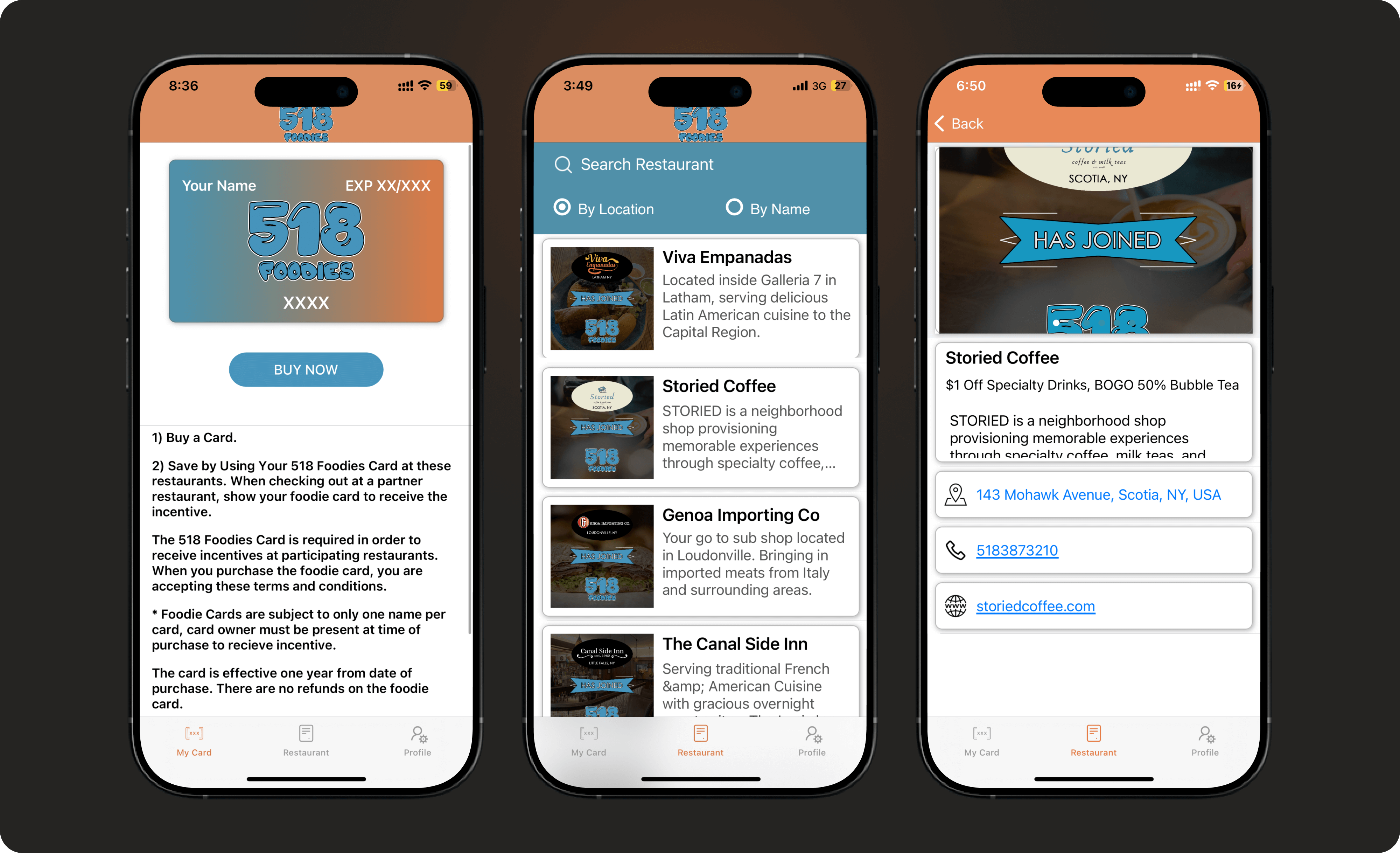
0.1
Old designs
IMAGE
SOLUTION
Ideation
Having completed the design audit, I brainstormed on solutions that could improve the user experience and conversion rate of the app. I used the “How Might We” Questions that enabled me focus on key area to improve
HOW MIGHT WE QUESTIONS
01.
How might we improve the user experience of the app ?
02.
How might we increase the conversion rate of the location card?
03.
How might we use the map to enhance user experience?
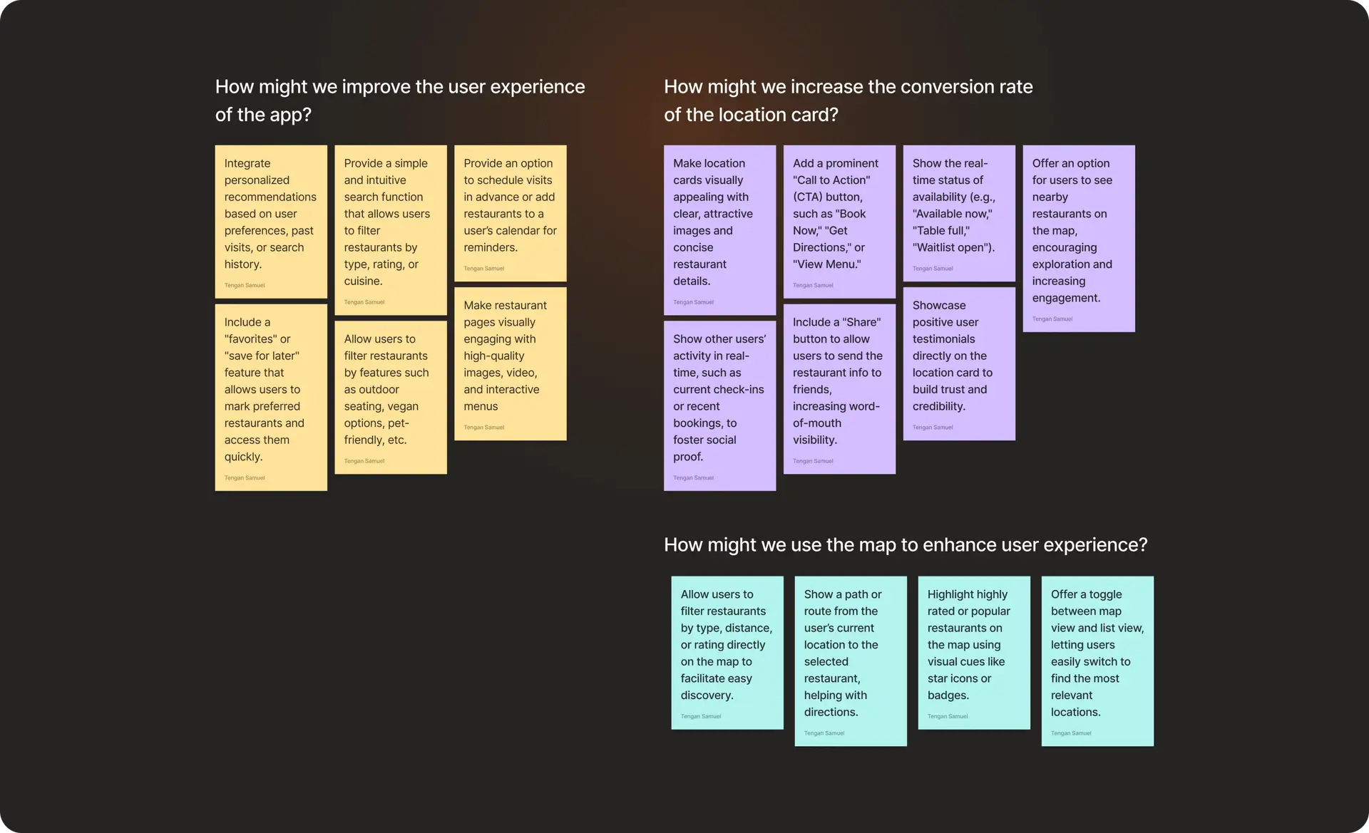
Addressing the “how might we” question helped identify key features of the app to tweak and new features to add. I then explored sketches and prototypes for potential solutions.
0.2
How might we ideation
IMAGE
SOLUTION
Solution
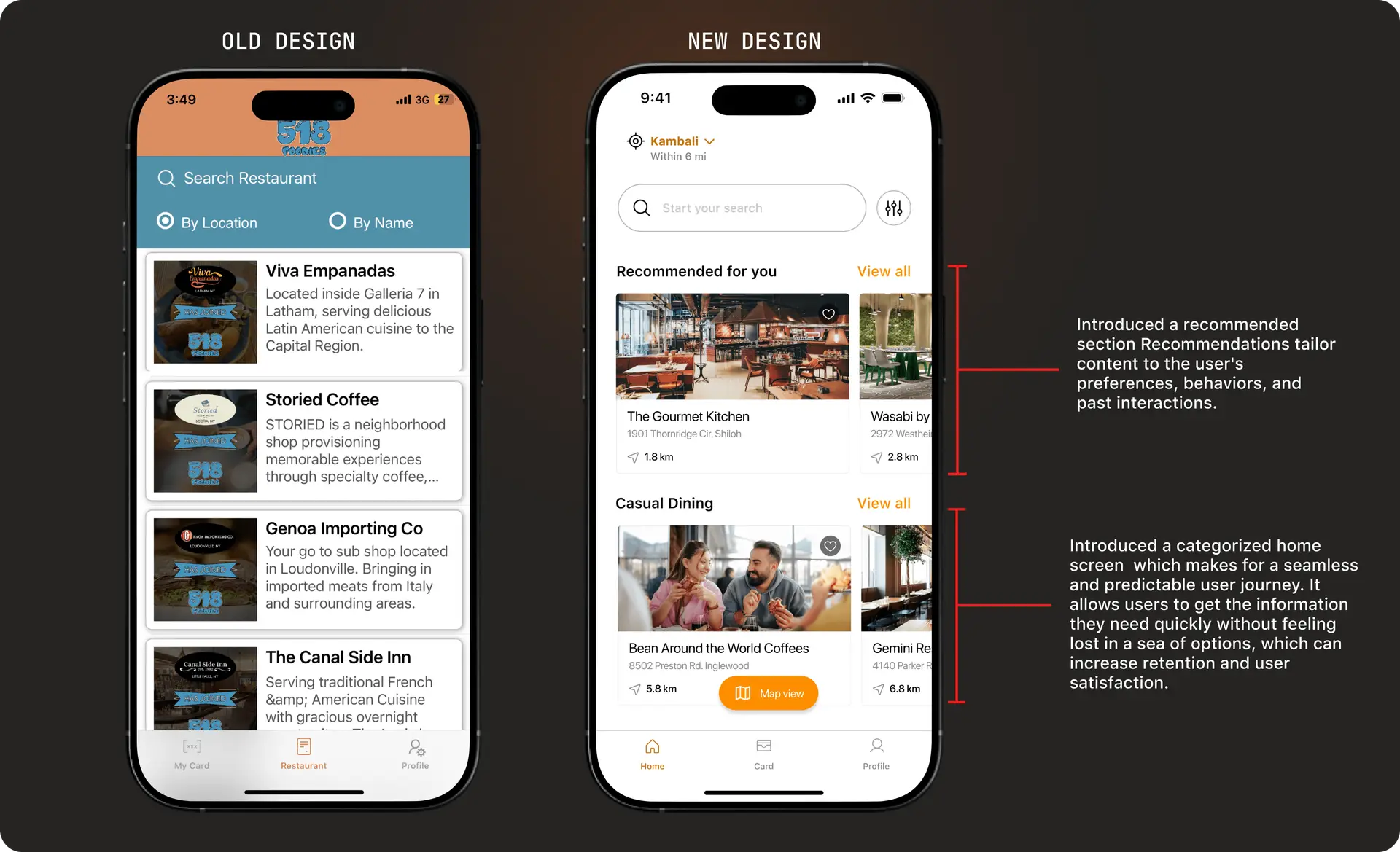
HOME SCREEN
Redesigned the home screen by categorizing restaurants on the home screen not only improves the navigation and decision-making process but also enhances the overall user experience by making the app more intuitive, personalized, and engaging. It allows users to find exactly what they want more quickly and encourages them to explore new options.
0.3
Home screen redesign
IMAGE
SOLUTION
Solution
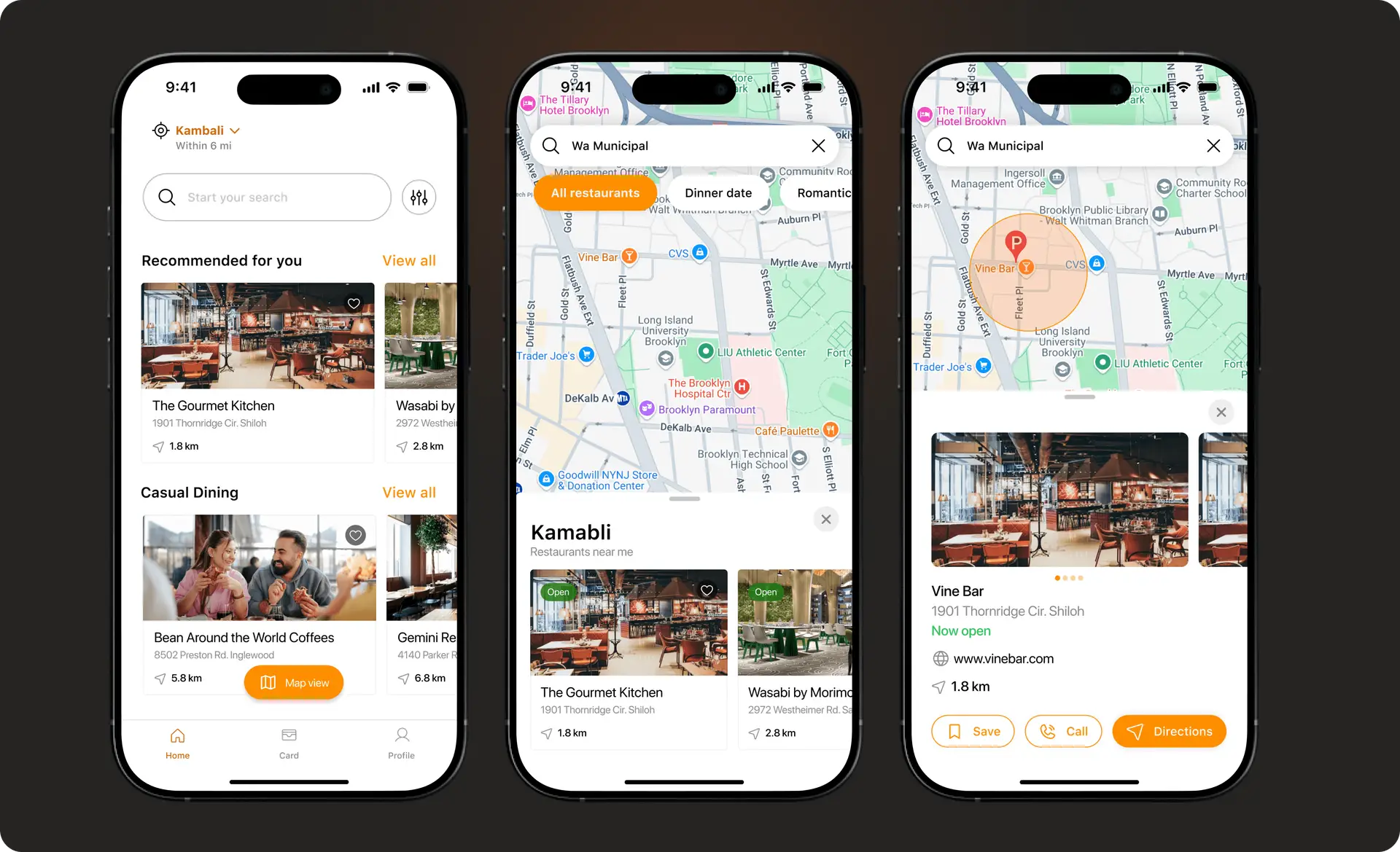
MAP FEATURE
To enhance the app’s ability to help users easily find restaurants, it’s essential to implement a map feature that offers a visual representation of restaurant locations.
This feature will allow users to seamlessly switch between a map view and a list view, providing flexibility in how they explore their options. In the map view, users can search for restaurants based on proximity, with nearby options clearly displayed.
Additionally, users will be able to search by restaurant name and view relevant results on the map. To further improve the experience, the app will display the estimated distance from the user’s location to each restaurant, ensuring users can quickly assess the convenience of each option. This streamlined navigation enhances both usability and user satisfaction.
0.4
Map feature
IMAGE
SOLUTION
Ideation
CARD SCREEN
Redesigned the card screen to help improve conversion by using the Fogg Model.
IMPLEMENTATION OF FOGG MODEL
M
Motivation:
I started by moving the benefit to the top to encourage users to join the 518 Foodies program.
A
Ability: I introduced the starting price, which shows the cost the subscription starts with. This allows users to know if they can afford the subscription plan.
P
Prompt: I brought the subscribe button to the button as a cue to the next step to take.
0.5
Card screen design
IMAGE
OUTCOMES OR LEARNINGS
Outcome
LEARNINGS
It was interesting to explore how to blend psychology with design to improve conversion rates.